
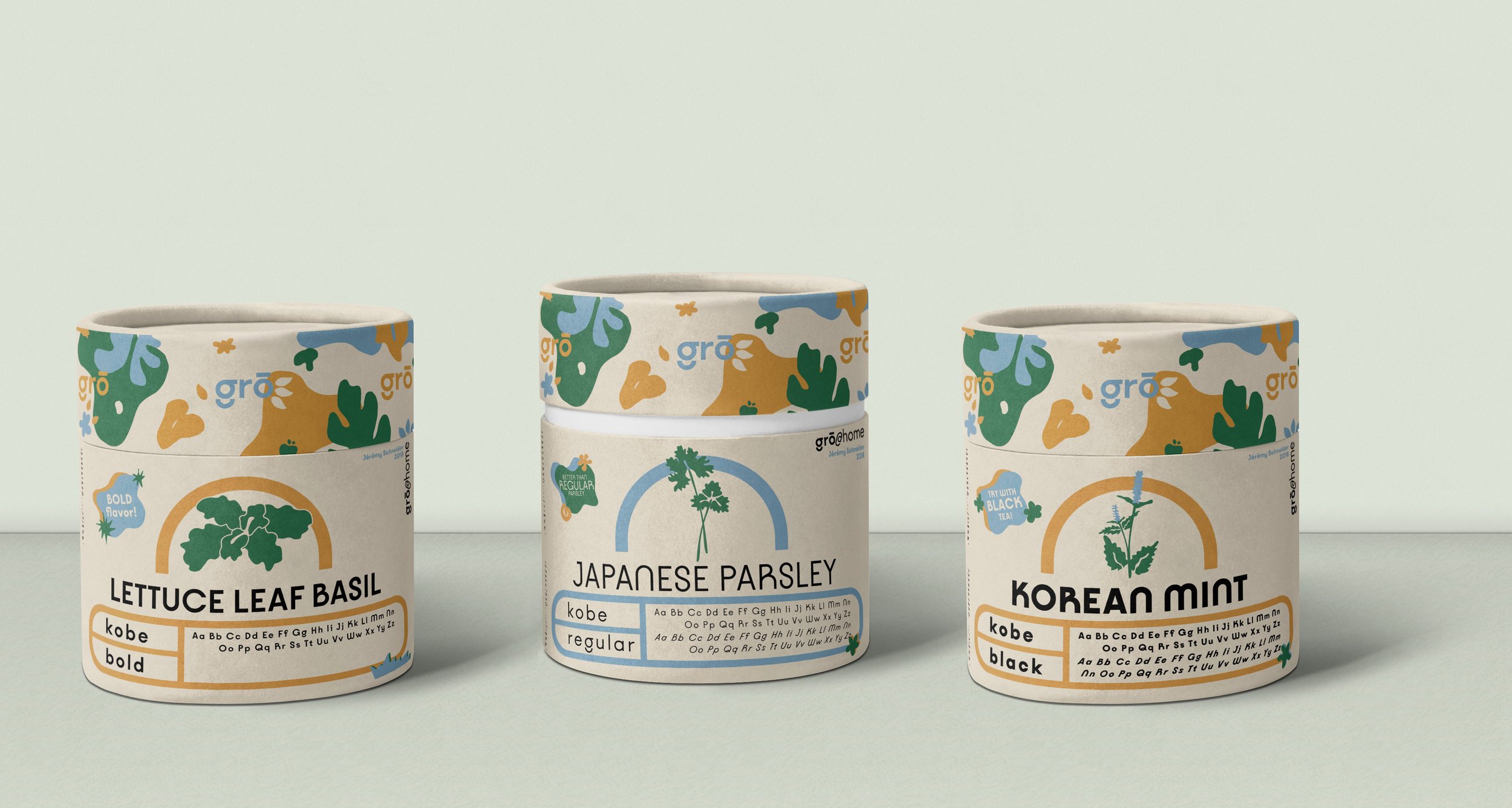
This project was all about finding a creative way to display a unique typeface. After choosing the typeface Kobe (designed by Jeremy Schneider in 2018 for the VJ Fonts Typehouse), I knew I needed something more organic to contrast the type’s very geometric shapes. This is how I created the herb business gro, where each herb that was sold would display a different weight of Kobe. Check out the final product and some details about the product below.
grō Typographic Exploration
PLANTING THE SEED
grō x Kobe Final Product
-
![]()
gro Japanese Parsley: Representing Kobe in regular weight and italics.
-
![]()
gro Korean Mint: Representing Kobe in bold weight and italics
-
![]()
gro Lettuce Leaf Basil: Representing Kobe in black weight.
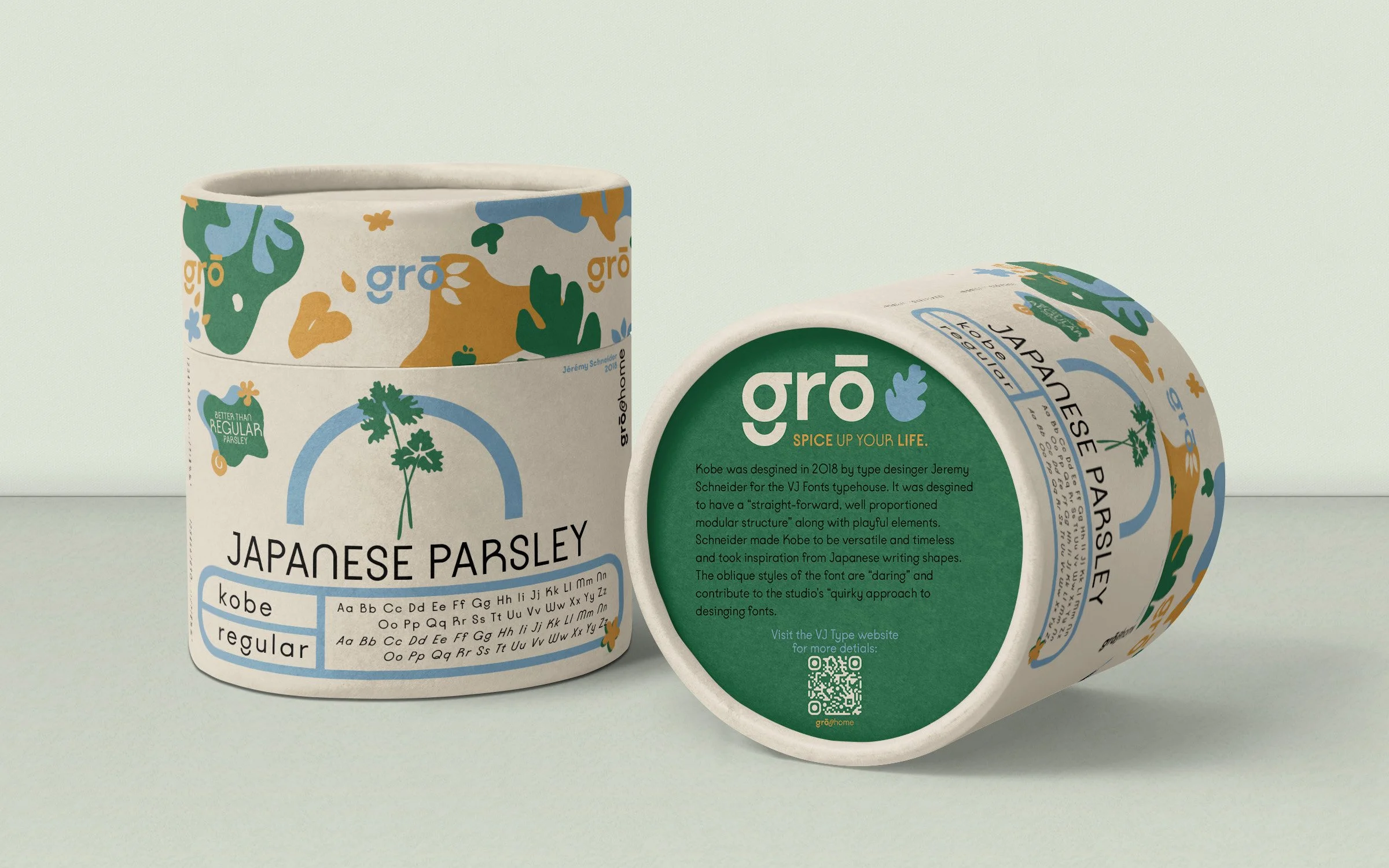
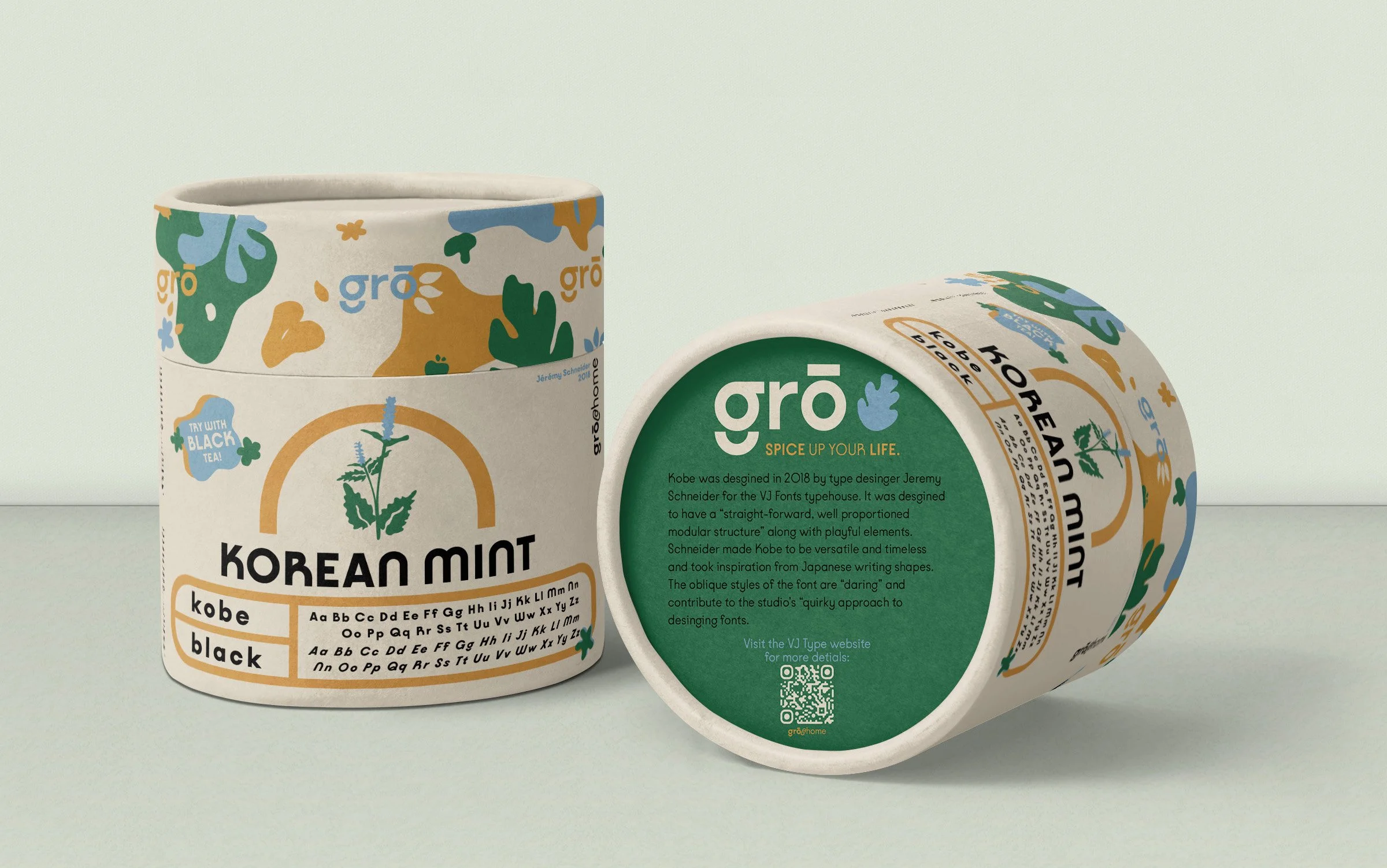

Finding the typeface meant allowing myself to moving on to what would accompany it as a display medium. Packaging for gro, a direct to consumer herb company, became this medium. When designing the packaging, I knew I needed to include organic, hand drawn shapes.
SKETCH IT OUT

Details on grō
-
Kobe is versatile yet timeless, with a straight-forward, well-proportioned modular structure. The numerous ligatures and stylistic sets take inspiration from Japanese writing shapes.
-
The colors chosen were meant to be calm and natural, but yet offer a bit of pop to the design. Color inspiration was taken from Matisse’s woodcuts and Flower Market posters by Astrid Wilson.
-
The idea behind gro is that it would deliver a bag of soil and packet of seeds of unique herbs to the customers doorstep. The packaging would all be biodegradable so it could easily be planted in the ground. The mockups below illustrate what the idea would look like.